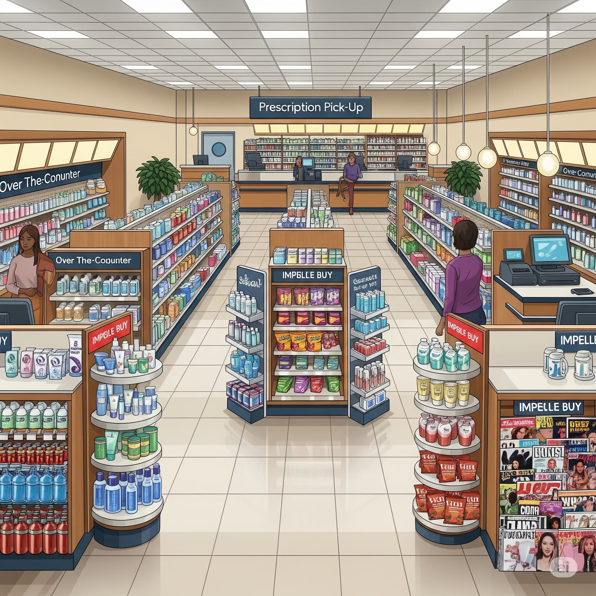
When you walk into a pharmacy, it might seem like everything is randomly placed — but that’s far from true. Pharmacy store layouts are strategically designed to guide your movement and influence your buying decisions. Over-the-counter (OTC) products like cough syrups, skincare, painkillers, and supplements are placed at eye level or in high-traffic zones to grab attention.
Meanwhile, essential prescription counters are usually placed at the back. This forces customers to walk through multiple aisles — increasing chances of impulse buying. Items like snacks, sanitizers, or cosmetics are often placed near the billing counter to tempt quick additions.
Even lighting, music, and shelf arrangement are used to make you linger longer. The longer you stay, the more you’re likely to buy. It’s not just a store — it’s a smart system designed to combine healthcare and marketing seamlessly.
True. Most of the pharmacy shops utilize “planograms” (shelf-mapping based upon the customer data) to optimize the pharmacy space. These planograms help in deciding exactly at which position within the pharmacy space which product should be placed and this is done by using the data related to the general psychology of the customers and based upon the current trends in sales and the market research. There is something called as “olfactory/scent marketing” through which specific scents are used near the wellness shelf of the shop with related products and this is done with the objective of influencing customer behavior and for generating emotional triggers within the buyer’s mind. The 24/7 digital surveillance within the shop always tracks the internal traffic to observe towards which shop sections people are going more and accordingly optimizations are done in the shop-layout structure. “Color psychology” is used as well in many shops like the shelf is colored green where products related to natural cure exist and likewise white/beige for soft products that are gentle on skin and for the body and blue for products that give relaxation against anxiety/stress. Everything is carefully planned targetting the perceptions of the customer and also for potential purchase.
Yes this is true it is the strategy to attract the customer . Cough syrups sanitizers soaps and cosmetics product are arranged in front area make lighting’s to that to attract more
Interesting how pharmacy layouts use psychology to influence buying like blending smart marketing with healthcare. Never realized it was so intentional!
Never realized how much a pharmacy’s layout can make us pick things we didn’t plan to! The way products are placed at eye level or near the counter really pulls you in. As a pharmacy student, it’s interesting to see how design can guide our choices without us even noticing.
This post shows how pharmacy layouts are more than just shelves—they’re smart strategies. I never thought about how walking to the prescription counter makes us see more products. Placing OTC items at eye level and snacks near billing is clever marketing. Even lighting and music play a role in making us stay longer. It’s interesting how healthcare and business are mixed in such a planned way. Good insight for both students and customers!
Exactly! A pharmacy isn’t just about medicines—it’s a well-planned space where layout, placement, and even ambience work together to influence buying while serving health needs.